How people hold their mobile devices is a crucial factor in app UI design. This affects the placement of important components for ease of access, such as the navigation buttons.
You should first be aware that not everyone holds their phone in the same manner, as this infographic illustrates:
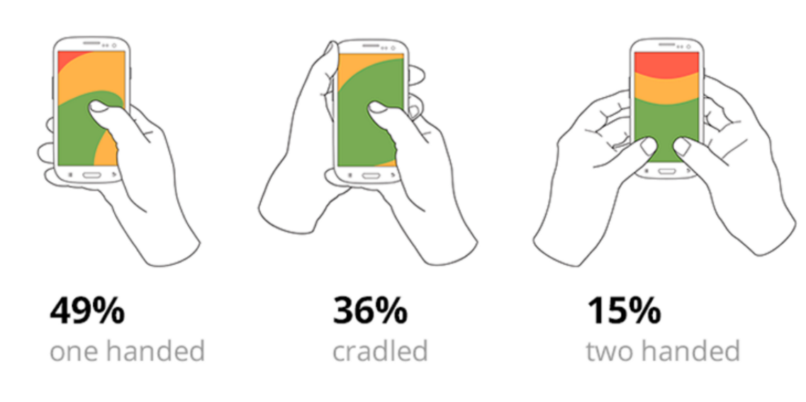
Source: Bootcamp
Take note of the green area. The thumb zone is where that is. It refers to the portion of the screen that people can conveniently access with their thumb.
Anything beyond those (the yellow and red areas) will make the person's fingers hurt and strain.
Therefore, since most users adopt a one-handed grip, it is a good UX rule of thumb to locate important interactive items there.
The diagram above, however, only takes into account the normal right-handed person. The green zones of people who are right- and left-handed overlap to form a real thumb zone, as demonstrated below:
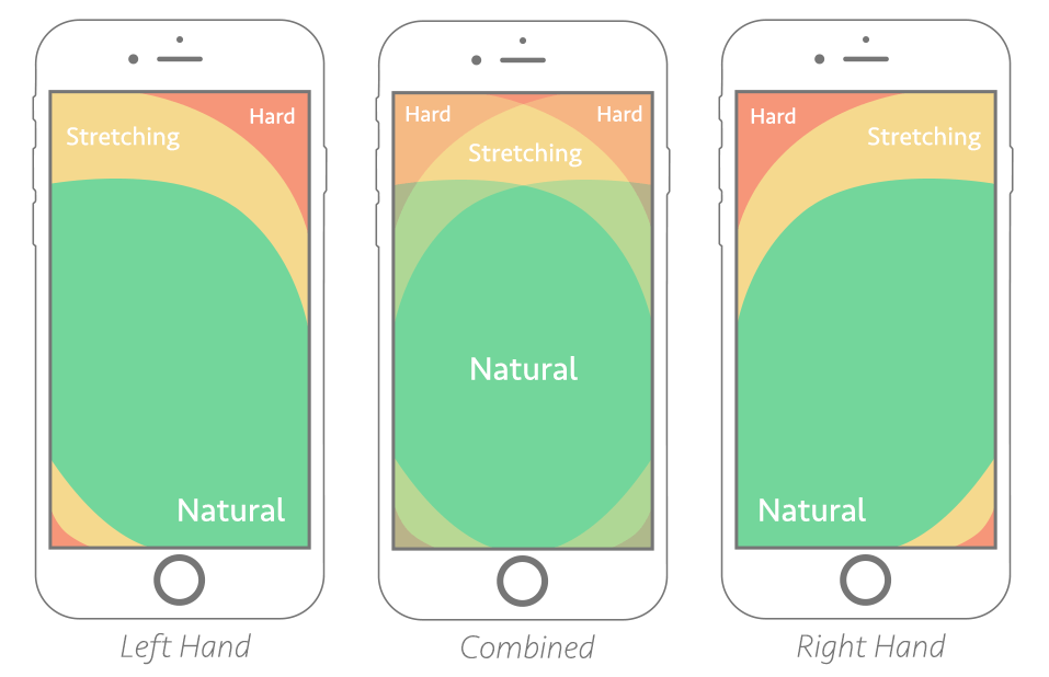
Source: Smashing Magazine
You should perform the thumb zone test while developing any screen for your app. Simply overlay the merged thumb zone from above on your user interface.
Make sure the crucial components of your design then fit within the green spaces.
This is why the bottom navigation panel is a popular UI design choice. It allows users to easily access your entire app using only their thumb.