
A clean and uncluttered design should be your top priority when developing your app. Not every piece of information needs to be visible on the interface. Organize your information so that it gives the user a clear sense of the functions that are offered. Keep the screen minimally cluttered and filled with content.
See, a lot of developers make the mistake of believing that stuffing an app with as many features as possible will make it appear more robust and rich to users.
However, a programme that makes too many simultaneous promises can result in the dilemma of choice.
Simply put, too many options will paralyze people into inaction.
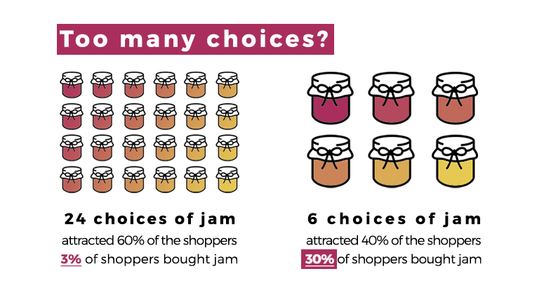
Source: Your Marketing Rules
The principle of "one screen, one task" is the best general guideline to use in this situation.
Think about Waze's user interface as an illustration. You'll see that its main screen primarily concentrates on one task—directing drivers.
The navigation bar and search are hidden, while other elements only show up when necessary.
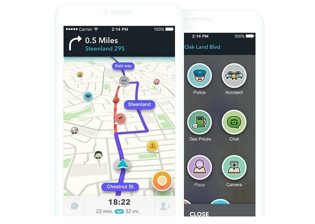
Source: Jewish News
If you need a lot of data from your user, this idea is very crucial.
The long form with multiple fields that’s a staple in webpages won’t cut it on the smaller screens of a mobile device.
The answer is to divide it into multiple screens.
Consider the onboarding process at Fastic. Take note of the fact that each screen just contains one question, allowing the user to give it their full attention. This lessens tension and feeling of overwhelm.
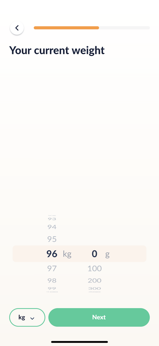
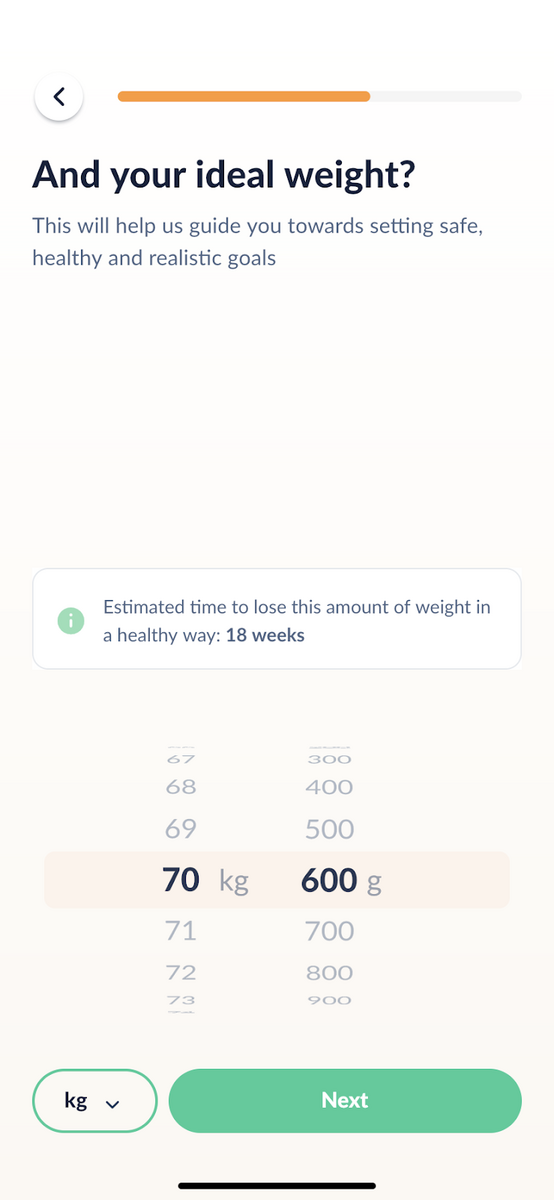
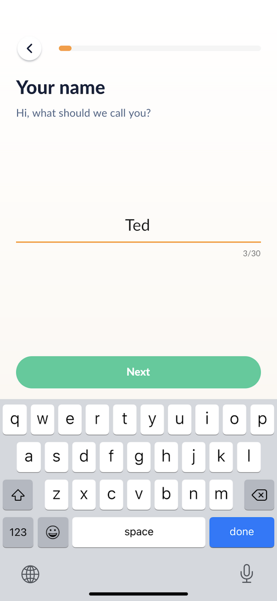
Source: Fastic
Additionally, you'll see that Fastic makes extensive use of white space throughout its UI design. This is a fantastic method to give your app a cleaner appearance.
Because a cluttered design will still make your app appear overwhelming even if you're only focusing on one element per screen.
This is due to the psychological impact of white space. It can, according to studies, boost a user's attention to a screen element by 20%.